The aim of effective User interface UI design is to eliminate as many barriers, bottlenecks, and other sources of confusion from the user experience. Above all, it is done to build a user-friendly environment that is easy for all users. Also, it helps manage and enable them to reach desired results with the least amount of hassle.
Of course, each UI design job is unique. Particularly when it comes to the smaller details. Also, the best option for desktop software or a website may not always be the same as that for a mobile app. Nevertheless, effective UI design fundamentals are universal across all projects and platforms.
The basic UI design concepts that are listed here can—and indeed should—be used in practically any UI design project you work on.
Aim For Simple UI Design
The UI design process is often fun. And so it should be. But it’s important to keep sight of your objectives, and a designer’s personal satisfaction should always be way down the bottom of this list.
Perhaps the most important of all the main UI design principles is simply not to forget who you are designing for, and why. Good UI design is practical; never decorative. Self-indulgent or overly formalist design only creates unnecessary noise; distracting from those elements that are truly relevant to the user.
UI design is often fun. So it should be. However, it’s crucial to stay focused on your goals, and a designer’s personal satisfaction should always rank quite low on this list.
Simply remembering who and why you are creating for could be the most crucial of all the major UI design concepts. An effective user interface is seldom flattering. Overly formal or self-indulgent design simply makes noise and detracts from those parts that are actually important to the user.
If part of your UI design serves no practical purpose for the user, it shouldn’t be there.
Understand Users & Their Needs
But, how can you tell what is important to the user? Make sure you really understand your user and their demands. In fact, it’s one of the very first UI design steps to take. After accomplishing this, you will be able to anticipate what the user would want to do next.
You may now give the user exactly the resources, tools, and information they require. And just when they are needed. If this isn’t what you want the user to do, you can also anticipate their behavior by altering an earlier part of the design so that it directs them in a completely different direction from the start.
Give Them Full Control
Whether or not they are actually in control, users should feel completely in charge. This refers to making the user interface fade into the background. Naturally, it should be accessible whenever the user needs it. But no user should ever feel as though the interface is pushing them to choose a certain course of action or making choices on their behalf. Even though in certain instances, this may be exactly what’s happening.
Make It Methodical & Consistent
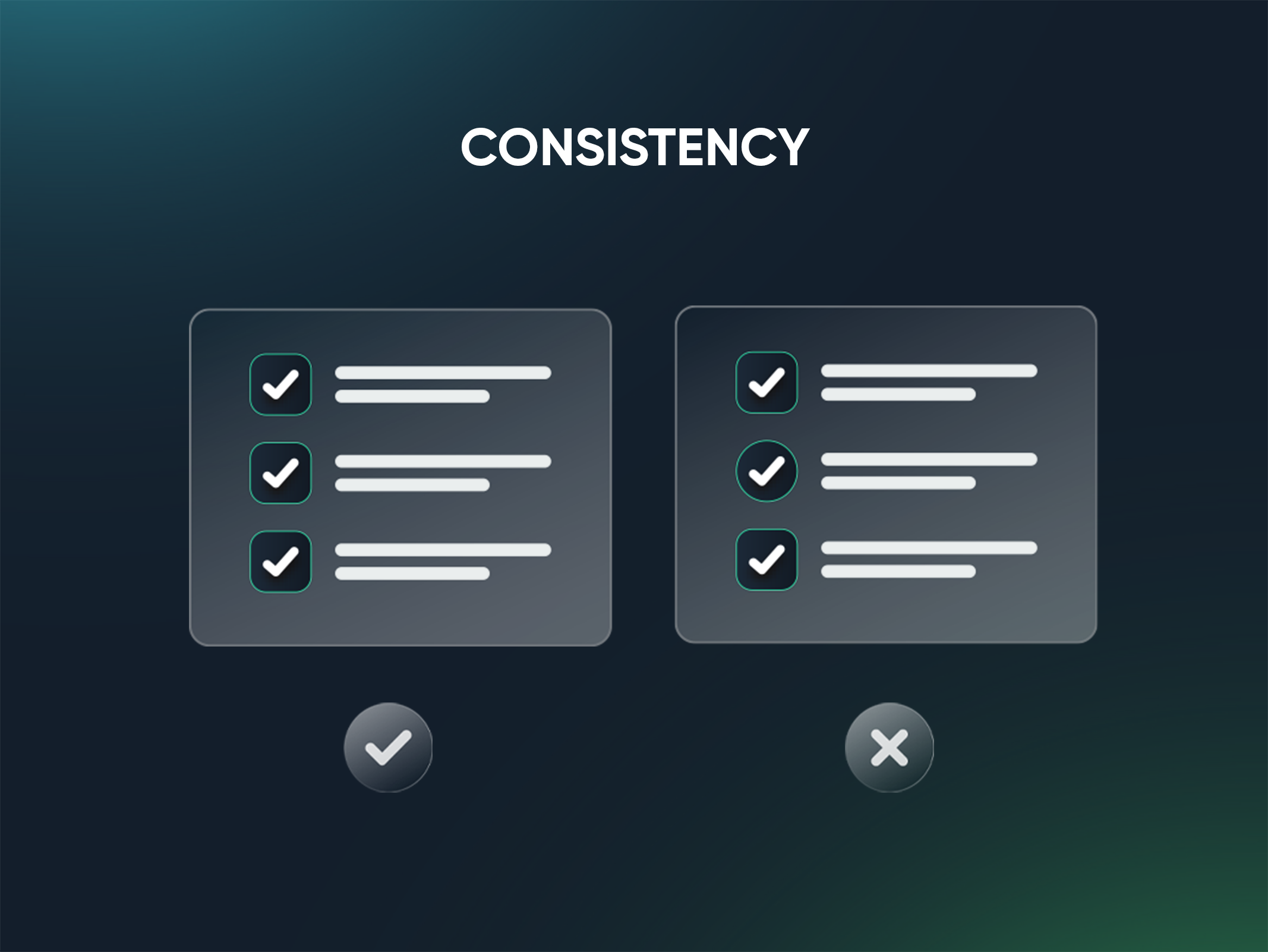
Being consistent is one of the basic UI design principles to grasp. Not only internally, but also with other places that use industry standards. Good UI design initiatives make improvements rather than reinvent the wheel. We do support innovation where it’s required. However, unnecessary changes won’t help the cause.
This guideline is applicable to terminology as well as patterns. When in doubt, follow the advice that is most frequently accepted.
Having said that, it might be as crucial to distinguish newly introduced or unusual functions from those that came before them. And perhaps the best way to do this is to defy one of our own precious UI design rules. We can use irregularity to highlight key and innovative features. Just remember that purposeful inconsistency differs greatly from careless or erratic conduct.
Avoid Complexity In The UI design
Try to aim for the fewest steps and screens all the time. Utilize overlays like bottom sheets and modal windows to compress data and minimize the size of your app.
At the same time, be sure to arrange the data in a logical, independent, and self-sufficient manner. In reality, grouping jobs and subtasks together are one of the guiding principles of UI design. This grouping should always be done practically as well as conceptually.
Similarly, always keep the number of steps necessary to perform a task to a bare minimum. Avoid making consumers navigate a time-consuming maze of clicks when one or two actions would do. The Three Click Rule, one of the most useful UI design guidelines, specifies that a user should be able to complete any action or retrieve any information they need by clicking no more than three times from anywhere inside the app.
Label The Signposts
Another core UI design concept focuses on information labeling and intuitive layout. Even for first-time users, using your app shouldn’t be daunting or difficult in any manner. The interface should be pleasant to explore and should be used almost unconsciously.
Make sure the page architecture is straightforward, logical, and well-marked. There should never be any confusion among users regarding their location inside the software or the steps required to go to any other location they may choose.
Don’t place the onus on the user to recall how they came to their present position. Instead, whenever it is essential, give visual cues for navigation.
Minimal And Streamlined UI
One of the most frequent barriers preventing people from building a really simple and streamlined UI is the failure to establish a clear hierarchy. Every element on all the screens should be absolutely necessary to the user experience. As we’ve already emphasized, with any extra elements being removed throughout the prototype phase.
Prioritize the functions and make users experience what you want them to, first. This could be as simple as changing the size of buttons, text, or other elements.
UI For Accessibility
Don’t assume that users will all be exactly like you and the people you know. This holds true for every aspect, including technical expertise and global perspective.
People from a wide range of cultural backgrounds utilize apps. Don’t instantly assume that the way you do things is the only reasonable way to do them, even though you really can’t be expected to account for every potential variance in social and cultural practice.
Even very basic elements, like the colors you use, will be perceived differently by other individuals. Additionally, this isn’t merely a matter of personal preference or cultural variances; after all, a sizeable section of the global population is color blind.
Despite the fact that using colors to distinguish UI design parts and functionalities is a viable strategy, still, you can’t only rely on those. Instead, utilize a combination color or another variable to distinguish between vital functions in a way that will be acceptable to all users.
A strong user interface (UI) design produces a frictionless environment in which users may flourish and the design itself almost vanishes from view. Similar to how we tend not to notice the air we breathe until it gets contaminated or until we run out of it.
The best designers are aware that adhering to basic UI design principles like those we’ve discussed above may contribute to the creation of a more useful user interface, enabling interaction to the point where the user hardly notices the UI.
Crafting Award-Worthy 3D Web Experiences: Lessons from Behind the Scenes
Bringing a 3D model to life on a website isn’t just about making it look good, it’s about creating an experience that is easy to navigate without compromising performance. At Face44, our team has encountered and overcome the challenges of embedding high-quality 3D...
Essentials Of An Interesting Homepage Design
Your homepage design must cater to numerous obligations. Instead of being centred about a single action, it should be created to serve a variety of audiences from various backgrounds. It must be resolutely constructed in order to accomplish this proficiently. In...
Chronicles Of The Best Game App Design
How many hours per week do you spend playing video games on average? That's accurate, many can easily spend half of their time playing games or looking for them on their phones. Searching and playing can take anything from 2 to 10 hours. On a daily basis, 61.6 percent...
