It’s been a while that we’ve been using Figma for client projects, and we are pretty impressed by all the valuable features that Figma has baked into their app. So what used to be a workaround for Sketch has now become a turning point and a thought-out feature in Figma – a sigh of relief!
Our designers frequently stumble upon features on Figma that we wish we knew about earlier – and some of them are tremendously helpful. To help all the designers out there, we have jotted down a list of 5 Figma tricks that could potentially level up your design game. Let’s unwrap the tricks at warp speed!
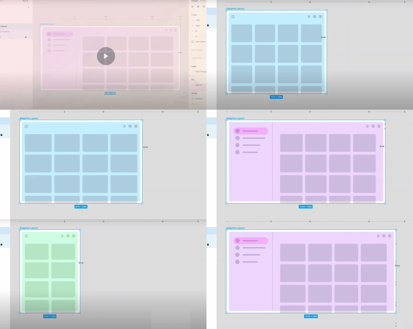
Number 1 – Breakpoints
The only flex we love the most.
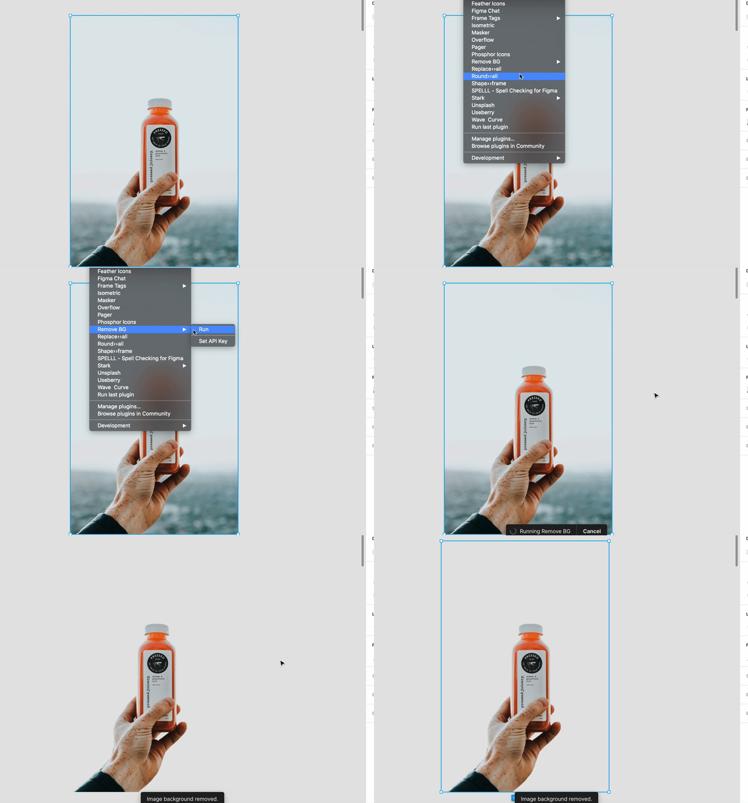
Number 2 – Remove Backgrounds with one magic click!
With the “Remove BG Plugin,” you can make your pictures transparent with just ONE CLICK – split-second – blazing fast!
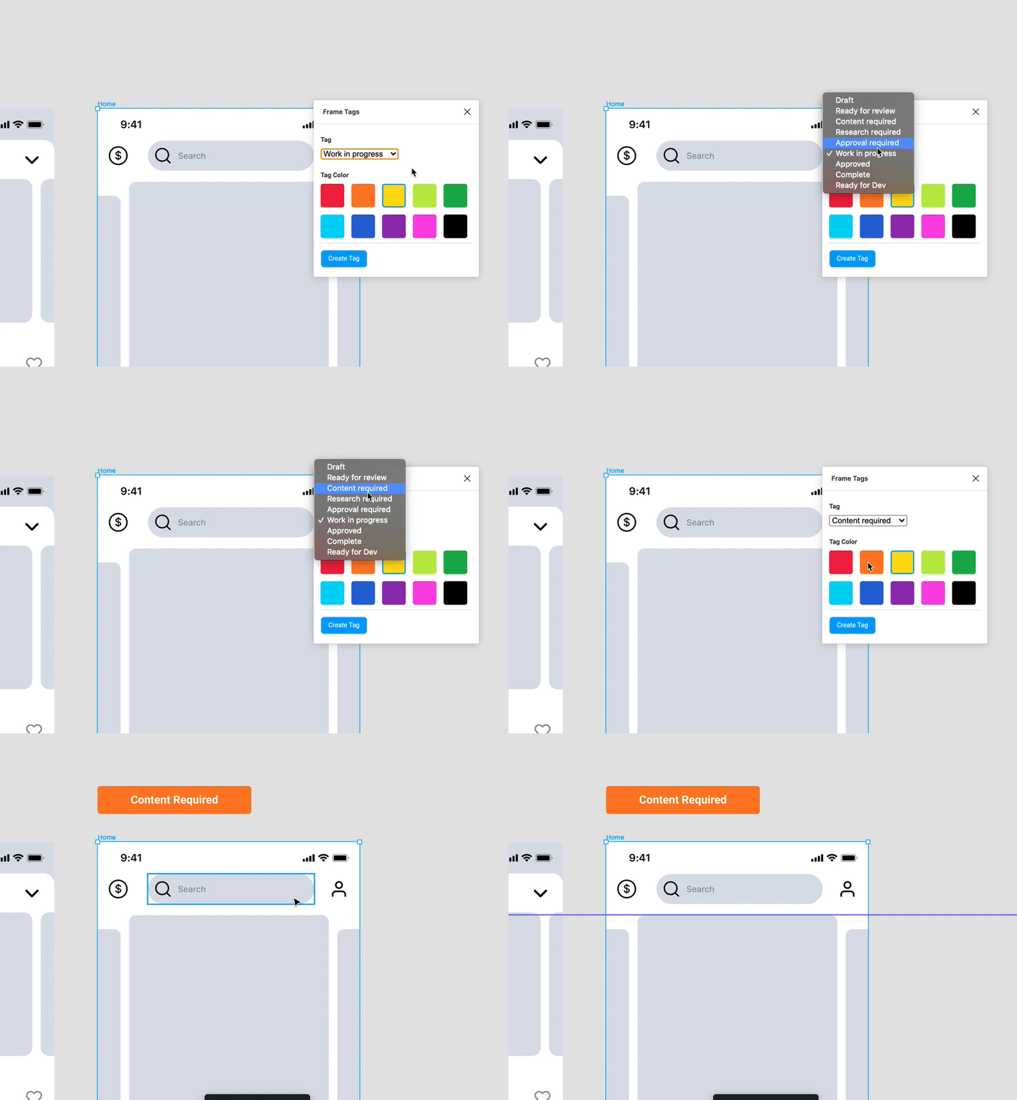
Number 3 – Status tags to frame
Here it is, your time savior. With Frame Tags plugging, you can quickly add status tags on the design frame, so there is no need to separately clarify the status to all the involved collaborators. The cool part is that you can create your own status tags or even use, from the pre-listed ones.
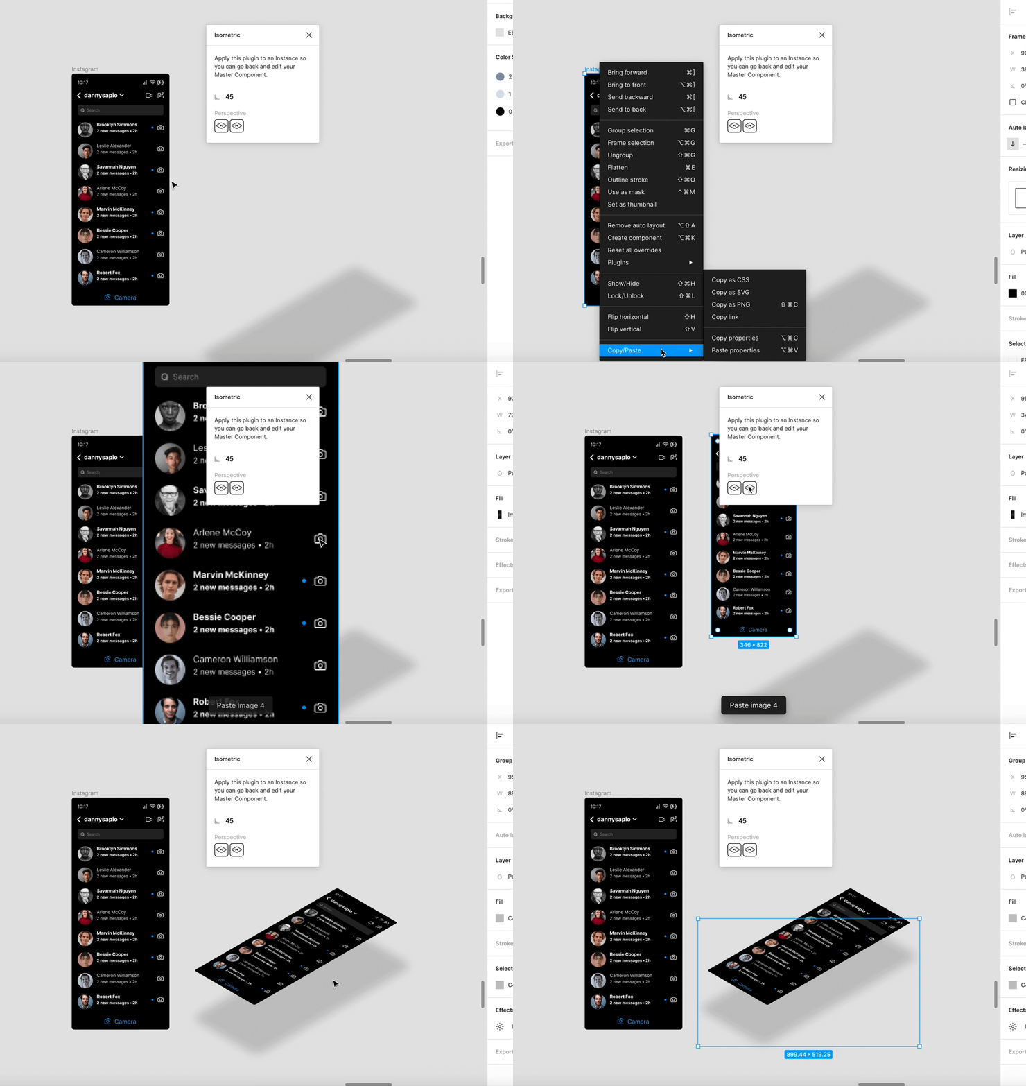
Number 4 – Isometric Designs with a click
So there is no need to spend hours creating the perfect isometric designs in illustrator. You can do that in a blink of an eye with the isometric plugin. Set up your desired value, and boom, you are good to go.
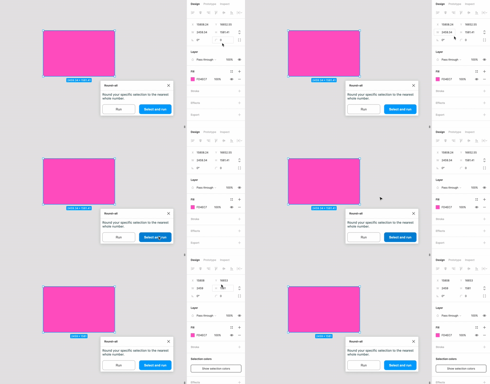
Number 5 – Round to the nearest whole number
With the Round >> All plugin, you can get the round numbers with just a click. When scaling with the scale tool, just press K to get that done in a whoosh.
And to fix this command, press CMD (CTRL) + A to select all artboards in your design file and then simply run the plugin for pixel perfection – and let the magic being – a sight worth watching!
